viernes, 26 de septiembre de 2008

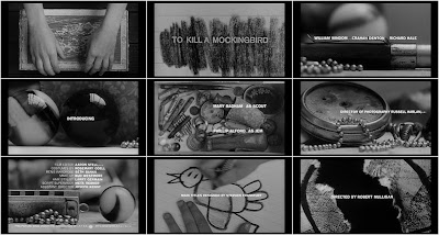
To kill a Mocking Bird


Opening titles have been neglected for such a long time and now they are being observed as the pieces of art and design that they are. Subtle, suggestive and eye catching the title sequences have to reveal and hide in the exact amount.The art of the title website brings to us a lot of title sequences and specially To kill a Mocking Bird titles that we think are absolutely fabulous.

Via Computerlove

miércoles, 24 de septiembre de 2008

Young Illustrators Award

Part of Illustrative 08 in Zurich the YIA showcases a lot of great quality illustrators, here are my black and white favourites and check the award website to see the other great illustrators.
The first one is Alina Günter, Illustrator based is Zurich, she has an amazing array of things but check specially "I was a swiss banker" great illustration in Motion and lettering.


The second one is German illustrator Heiko Windisch his work in Black and white has the subtle creepiness that we like so much.And the last but not least Marco Romegialli aka Workingclasshero also from Zürich.


Well it seems that Zürich is a great place for illustration, chocolate and other things ;-).

viernes, 19 de septiembre de 2008

Homo Homini Lupus

Santiago Rivas shows a very complex and layered installation of elements in his project thesis. I still don't have all the layered theoretical text that backs it up but here are the striking beautiful images. The title of the project is HOMO HOMINI LUPUS is a latin proverb that means "man is a wolf to man". It is possible that he is discussing human innate violence and all the elements that makes us no more than animals but interpret it yourself and for the curious I will try to get some more insights about it later.

jueves, 11 de septiembre de 2008

big scale talent


Frank Magnotta says in his interview by Ryan Christian "Honestly, I've never really thought or been interested in color. I swear I dream in black and white, so, to me, this lack of color represents a more internal process. In a way the neutrality gives the work a coolness as well as a distance from the very colorful and dynamic media that it's culled from."(so like me)
Big scale (1,30mx1,50m)and intricate his drawings are in here and the interview here.

MRZYK & MORICEAU


Everything is so black & white about these artists, amazing how they work the monotone, great instalations and simple intelligent representation. Access there website here


Ladies and Gentlemen one of our favorites Serge Seidlitz!

miércoles, 10 de septiembre de 2008

Stefan Glerum


He says modestly that he is just glad to be a part of the show, but I really will like to see more of his work taking the spotlight. He doesn't have a lot of work available besides his blog. His drawings are very well crafted, they are kind of dark and the use of type as part of the image is really interesting.

miércoles, 3 de septiembre de 2008

Sad Song & Lady Day


New drawings. © Alejandra Céspedes 2008

DAVID FOLDVARI

David Foldvari is for sure one of our favourites with his intelligent and critical approaches he shows that Ilustration is mostly about ideas. Visit his blog for his most recent work and his website for the best selection of past work.

martes, 2 de septiembre de 2008

High Quality Movie scans


Find some inspiration in this great archive of portraits, posters and some other things. Download them, print them or whatever.

René Brantonne drawings


Oh yes we love the future in black and white, and french Illustrator René Brantonne makes it look good. Via deadlicious